Quickstart
This guide briefly explains how PopPUNK can be run on a set of genomes. For a more detailed example see the Tutorial.
We will work with 128 Listeria monocytogenes genomes from Kremer et al which can be downloaded from figshare.
Running PopPUNK
First download the example set above, then extract the assemblies and create a file with a list of their locations:
tar xf listeria_example.tar.bz2
ls *.contigs_velvet.fa > reference_list.txt
Now run PopPUNK:
poppunk --easy-run --r-files reference_list.txt --output lm_example --threads 4 --plot-fit 5 --min-k 13 --full-db
This will:
- Create a database of mash sketches
- Use these to calculate core and accessory distances between samples (which are also stored as part of the database).
- Fit a two-component Gaussian mixture model to these distances to attempt to find within-strain distances.
- Use this fit to construct a network, from which clusters are defined
where the additional options:
--threads 4increase speed by using more CPUs--min-k 13ensures the distances are not biased by random matches at lower k-mer lengths.--plot-fit 5plots five examples of the linear fit, to ensure--min-kwas set high enough.--full-dbdoes not remove redundant references at the end, so the model fit can be re-run.Important
The key step for getting good clusters is to get the right model fit to the distances. The algorithm is robust to most other parameters settings. See Re-fitting the model for details.
The cluster definitions are output to lm_example/lm_example_clusters.csv.
Check the distance fits
The first thing to do is check the relation between mash distances and core and accessory distances are correct:
Creating mash database for k = 13
Random 13-mer probability: 0.04
Creating mash database for k = 21
Random 21-mer probability: 0.00
Creating mash database for k = 17
Random 17-mer probability: 0.00
Creating mash database for k = 25
Random 25-mer probability: 0.00
Creating mash database for k = 29
Random 29-mer probability: 0.00
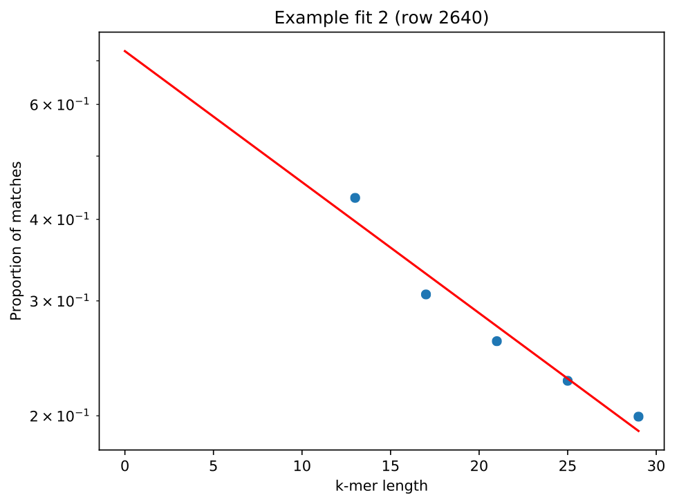
This shows --min-k was set appropriately, as no random probabilities were
greater than 0.05. Looking at one of the plots lm_example/fit_example_1.pdf
shows a straight line fit, with the left most point not significantly above the
fitted relationship:
Check the distance plot
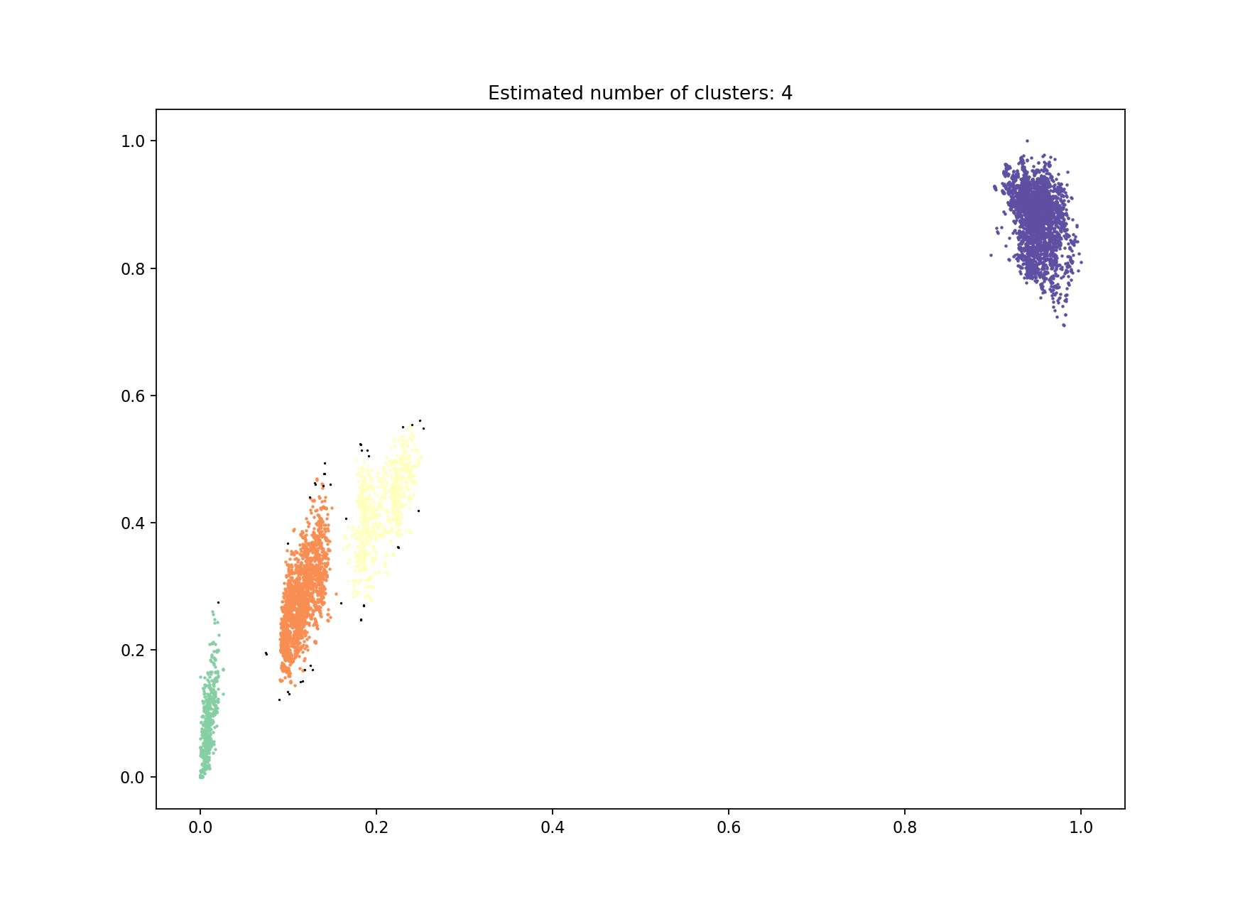
A plot of core and accessory distances contains information about population structure,
and about the evolution of core and accessory elements. Open
lm_example/lm_example_distanceDistribution.png:
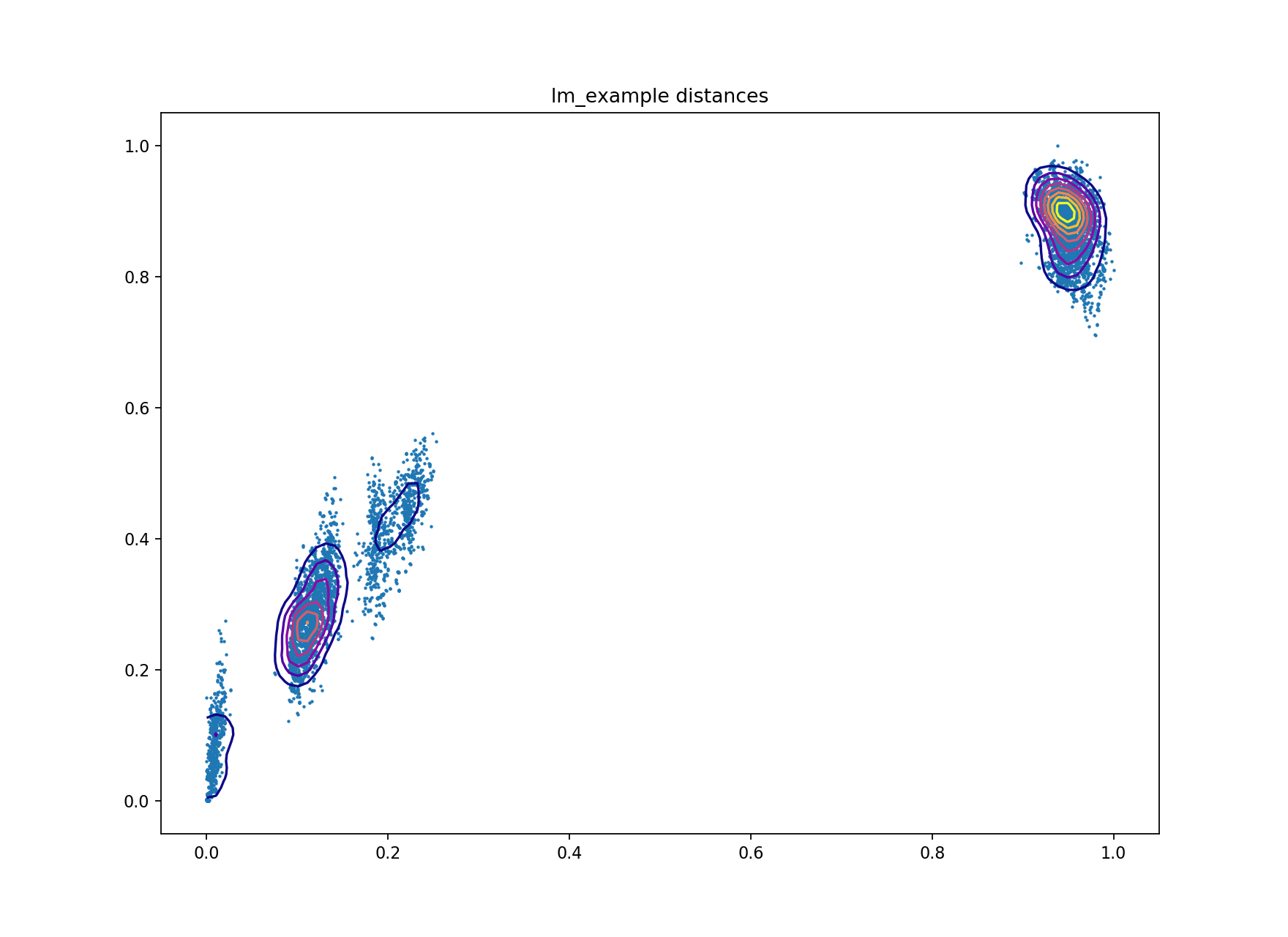
Each point is the distance between a pair of isolates in the collection. The x-axis shows core distances, the y-axis accessory distances. Lines are contours of density in regions where points overlap, running from blue (low density) to yellow (high density). Usually the highest density will be observed in the top-right most blob, where isolates from different clusters are being compared.
In this sample collection the top-right blob represents comparisons between lineage I and lineage II strains. The blob nearest the origin represents comparisons within the same strain. The other two blobs are comparisons between different strains within the same lineage. Overall there is a correlation between core and accessory divergence, and accessory divergence within a cluster is higher than the core divergence.
Check the model fit
A summary of the fit and model is output to STDERR:
Fit summary:
   Avg. entropy of assignment    0.0004
   Number of components used     2
Warning: trying to create very large network
Network summary:
   Components     2
   Density        0.5405
   Transitivity   1.0000
   Score          0.4595
This is a bad network score – a value of at least 0.8 would be expected for a good fit. A high density suggests the fit was not specific enough, and too many points in the core-accessory plot have been included as within strain. Looking at the fit this proves to be true:
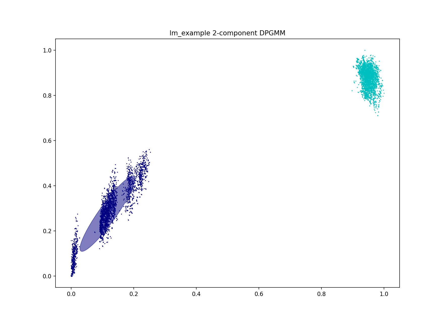
As only two components were used, the separate blobs on the plots were not able to be captured. The blob closest to the origin must be separated from the others for a good high-specificity fit. Inclusion of even a small number of points between different clusters rapidly increases cluster size and decreases number of clusters. In this example the initial fit clusters lineage I and lineage II separately, but merges sub-lineages (which we refer to as strains).
PopPUNK offers three ways to achieve this – two are discussed below.
Re-fitting the model
To achieve a better model fit which finds the strains within the main lineages the blob of points near the origin needs to be separated from the other clusters. One can use the existing database to refit the model with minimal extra computation.
The first way to do this is to increase the number of mixture components to the number of blobs you roughly judge to be in the plot. In this case there are four:
poppunk --fit-model --distances lm_example/lm_example.dists --ref-db lm_example --output lm_example --full-db --K 4
This correctly separates the blob at the origin – the ‘within-strain’ distances:
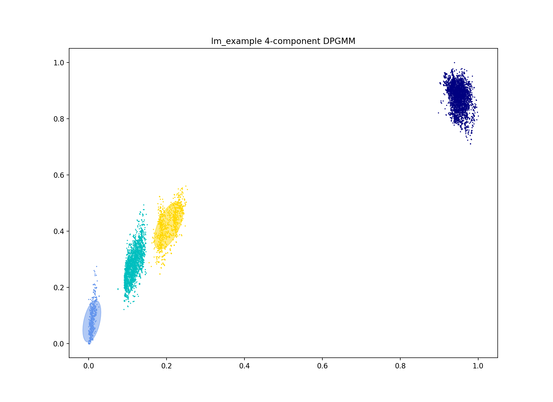
Which gives more clusters (network components) and a lower density, higher scoring network:
Fit summary:
   Avg. entropy of assignment    0.0076
   Number of components used     4
Network summary:
   Components     31
   Density        0.0897
   Transitivity   1.0000
   Score          0.9103
Alternatively DBSCAN can be used, which doesn’t require the number of clusters to be specified:
poppunk --fit-model --distances lm_example/lm_example.dists --ref-db lm_example --output lm_example --full-db --dbscan
This gives a very similar result:
with an almost identical network producing identical clusters:
Fit summary:
   Number of clusters      4
   Number of datapoints    8128
   Number of assignments   8128
Network summary:
   Components     31
   Density        0.0896
   Transitivity   0.9997
   Score          0.9103
The slight discrepancy is due to one within-strain point being classified as noise (small, black point on the plot). For datasets with more noise points from DBSCAN then model refinement should always be run after this step (see Refining a model).
Creating interactive output
Now that a good, high-specificity fit has been obtained you can add some extra flags to create output files for visualisation:
--microreact– Files for Microreact (see below).--rapidnj rapidnj– Perform core NJ tree construction using rapidnj, which is much faster than the default implementation. The argument points to the rapidnj binary.--cytoscape– Files to view the network in Cytoscape.--phandango– Files to view the clustering in phandango.--grapetree– Files to view the clustering in GrapeTree.
As a brief example, in the lm_example folder find the files:
lm_example_phandango_clusters.csvlm_example_perplexity20.0_accessory_tsne.dotlm_example_core_NJ.nwk
And drag-and-drop these into the browser at https://microreact.org/upload. This will produce a visualisation with a core genome phylogeny on the left, and an embedding of the accessory distances on the right. Each sample is coloured by its cluster:
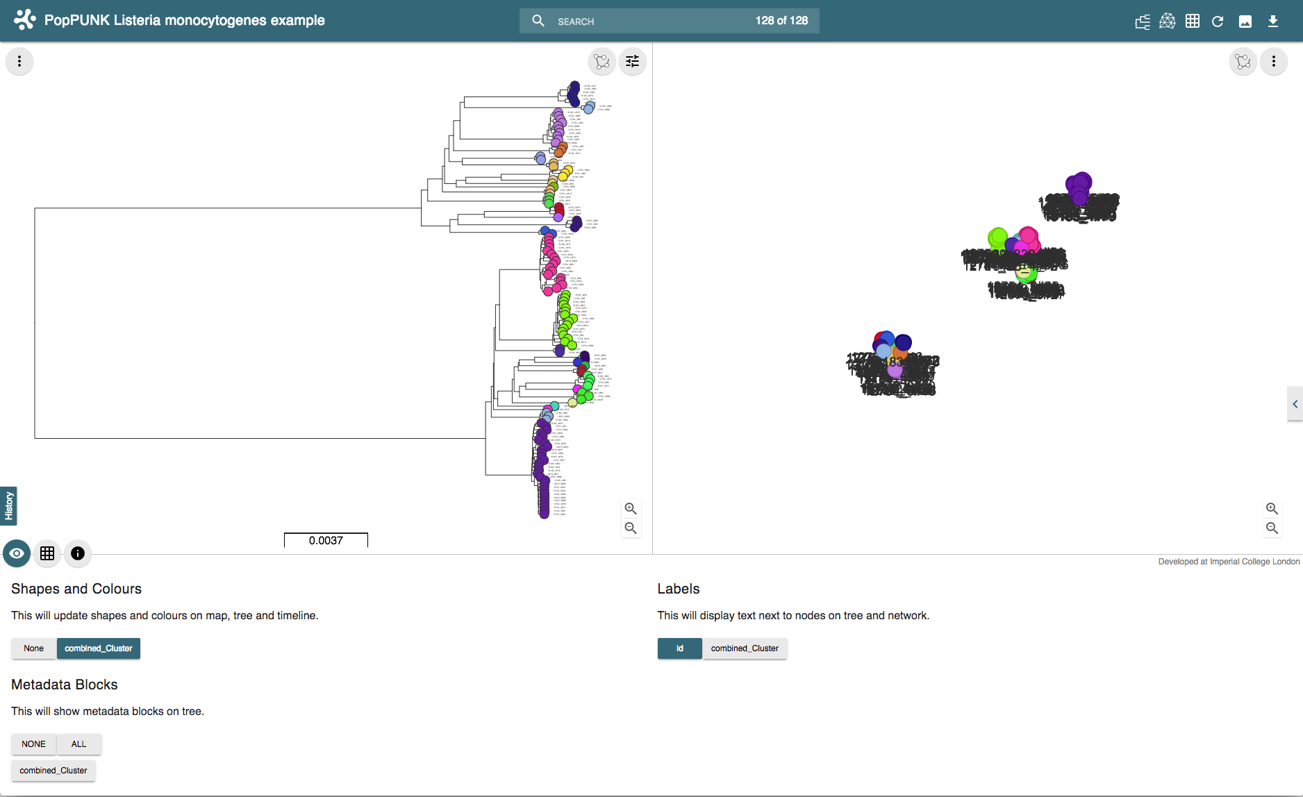
The interactive version can be found at https://microreact.org/project/rJJ-cXOum.